Mobile-First Top Responsive Design To Win The 2026 Mobile Index
When your website doesn’t load quickly enough for a potential customer to see on their mobile phone, what happens?They leave.No second chance. No inquiry. No sale.This is what the world is now. Mobile phones are no longer the second means of web browsing. They are the first place people look for a brand, shop online, and make a purchase. Google and other search engines are still judging websites based on their mobile experiences. Meanwhile, consumer expectations are greater than ever. The question isn’t whether you’ll go mobile-first. The question is: how badly do you want it?This blog will help you learn the mobile-first top responsive design strategies for the mobile index and for building an optimized website.

Understanding The Mobile Index
Today, the mobile index is based on three measures of digital excellence: speed, usability, and engagement. If your site is not responsive on mobile, then there is a high chance of losing the rankings. According to Scalify, 64% of the world’s traffic is coming through mobile phones. This means that having a top responsive and mobile-friendly website directly impacts the conversion rate. Now the rulebook is Google’s Core Web Vitals, which has expanded to the mobile experience signals. The top three metrics for which the top-ranked sites in the 2026 mobile index consistently outperform their competition are less than 2-second loading speed, no layout shift, and good navigation. Moreover, Interaction To Next Paint (INP) is essential for mobile-friendly design. It matters a lot as mobiles have less processing power, and it measures the taps or clicks. Not just the metrics. There is another challenge!To design an engaging website for mobile phone users, so they don’t think they are using a small screen.Design Finger-Friendly Mobile Interface
When using a mobile phone, the user’s thumb reaches about 50% of the screen easily. To reach the top of the screen requires some stretching. For the bottom, many of them use fingers. Still, there are a number of websites placing the most crucial buttons at the top center, the difficult spot to reach. Mobile-first winners place:- Primary actions (search, buy, submit) in the lower-middle zone
- Secondary options in the upper areas
- Navigation at the bottom is a sticky element
- Dangerous actions (delete, confirm) slightly outside the thumb zone to prevent accidents
Speed Is The First Impression
Loading speed on a mobile phone isn’t only about technology. It’s your first impression that you make with your website. Users want pages to load within a few seconds or less, and leave if it takes longer.As cited by Alexander Jarvis, slow loading times can reduce conversions by 7% per second and drive away 40% of customers.The first step in improving your site speed for mobile phones is to get rid of unnecessary things. The most common issues that cause mobile sites to slow down are:- Sizeable images
- Uncompressed media content
- Excessive scripts
- Poorly optimized code
Content Must Be Clear, Not Heavy
Content is different on mobile UX. People don’t read all the words; they scan. For this reason, long paragraphs are not very effective for smaller screens. This also applies to progressive web apps (PWA).Moreover, it is not about volume anymore; it’s about clarity. One idea per section, in a simple manner. Content that’s written clearly can be understood by users quickly without making a lot of effort. This does not mean that the quality has to be compromised. It is about taking out the complexity. Content is better presented on mobile devices if it is simple, clear, and flows.Readability and Typography Matter More on Mobile
The readability score of the mobile design depends on the typography. There are many fonts that look good on the computer screen but are hard to read on the mobile screen. The size of text should never be such that it is necessary to zoom in to read it. Moreover, line spacing also has a significant impact on readability as it makes the text appear more crowded on mobile devices. Good spacing ensures breathing space for the content and enhances scanning behavior.When text is hard to read or blends in with the background, users lose interest of the web application. Readability should be the number one priority of mobile top responsive design.If users can read easily, they will be able to absorb more of the content and that means you have the top responsive design.Mobile SEO Is Now the Primary SEO
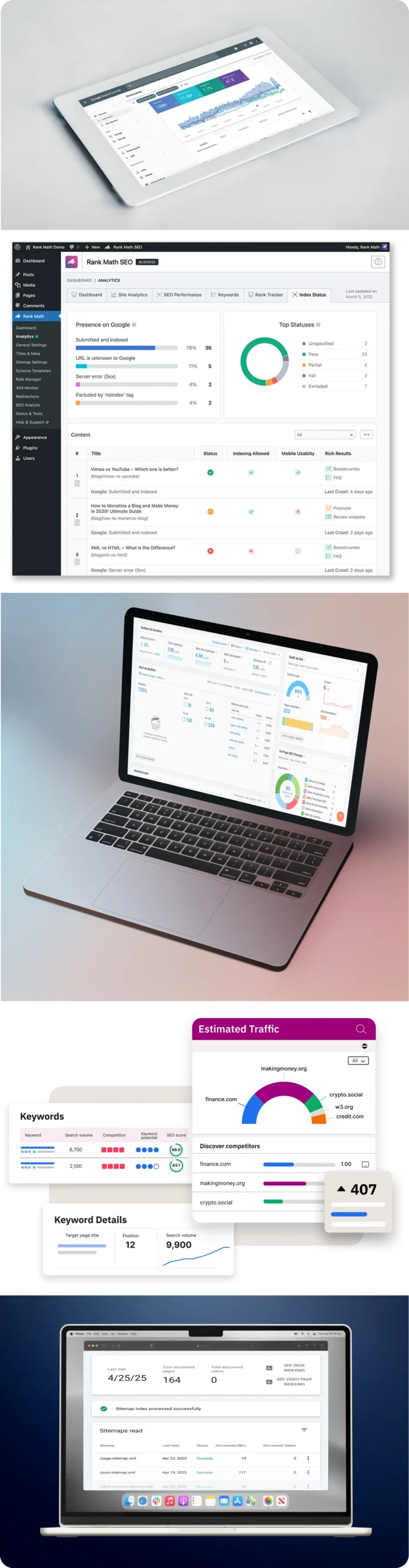
SEO is drastically different. Your mobile site now becomes your primary site that is being indexed. This implies that mobile will play a significant role in your SEO success.| Mobile SEO Factor | Why It Matters | Best Practise |
| Page Speed | Slow-loading pages reduce rankings and increase bounce rate | Optimize images, use caching, and minimize code |
| Clean Structure | Helps search engines understand and rank content easily | Use clear headings (H1, H2, H3) and logical layout |
| Core Web Vitals | Direct ranking signals based on user experience | Improve loading speed, interactivity, and visual stability |
| Responsive Design | Ensures proper display across all screen sizes | Use flexible layouts and mobile-friendly UI components |
| Mobile-first Indexing | Google uses the mobile version of your website for indexing | Ensure the mobile website has the same content as the desktop version |